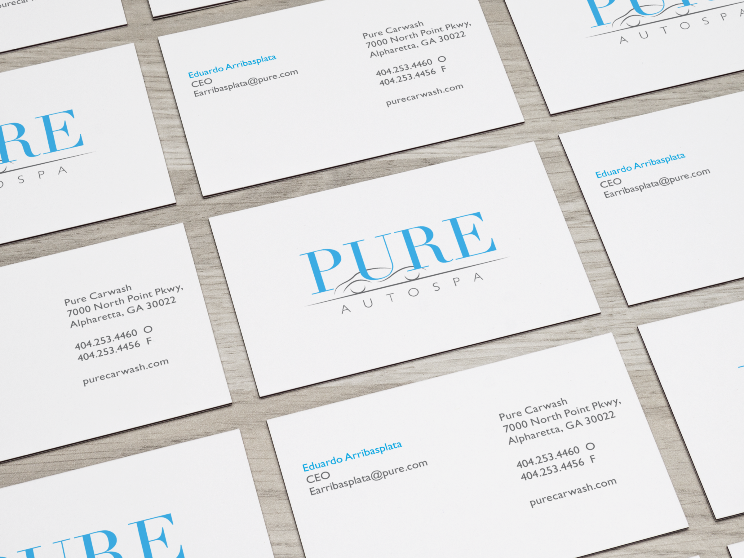
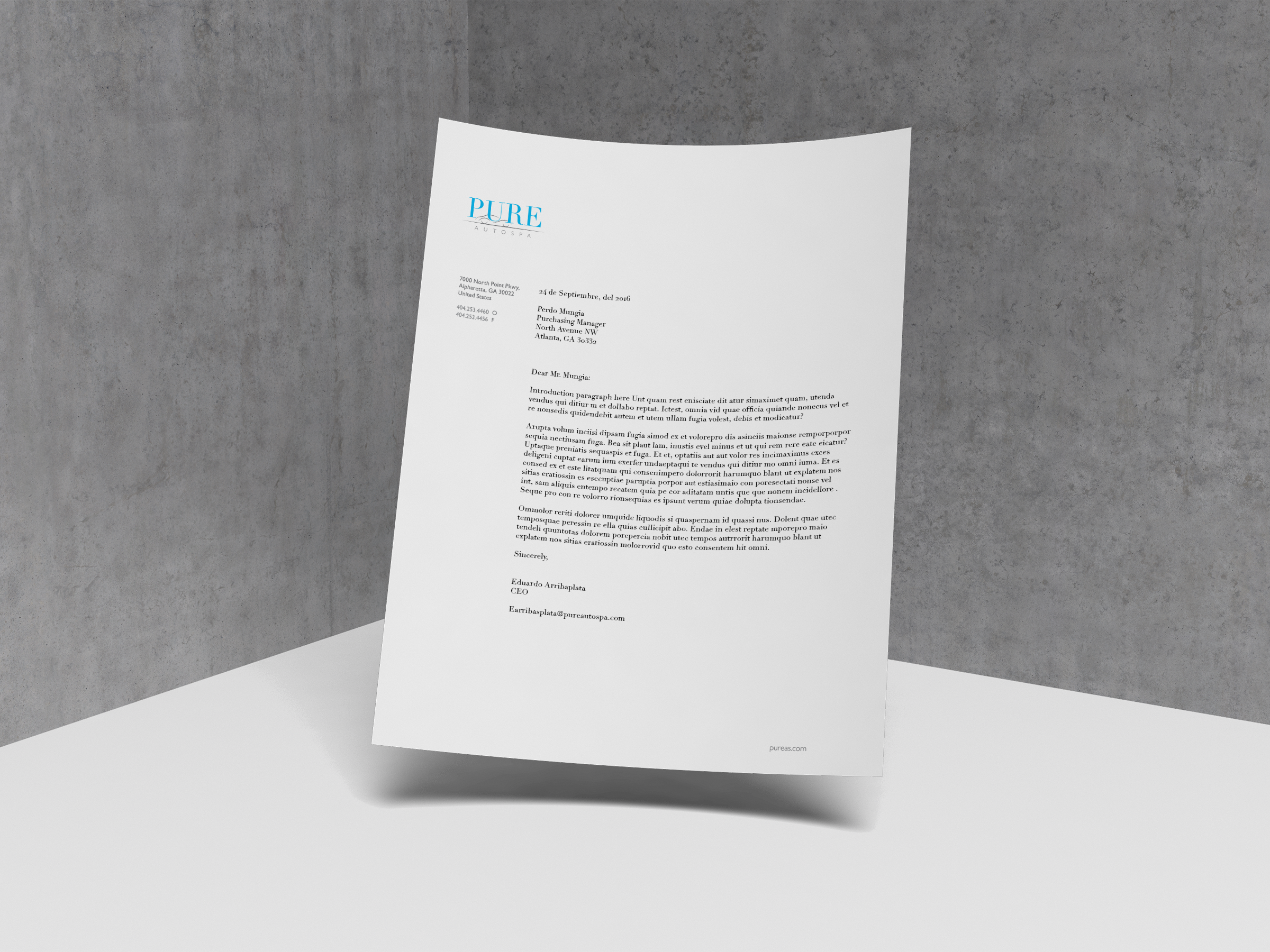
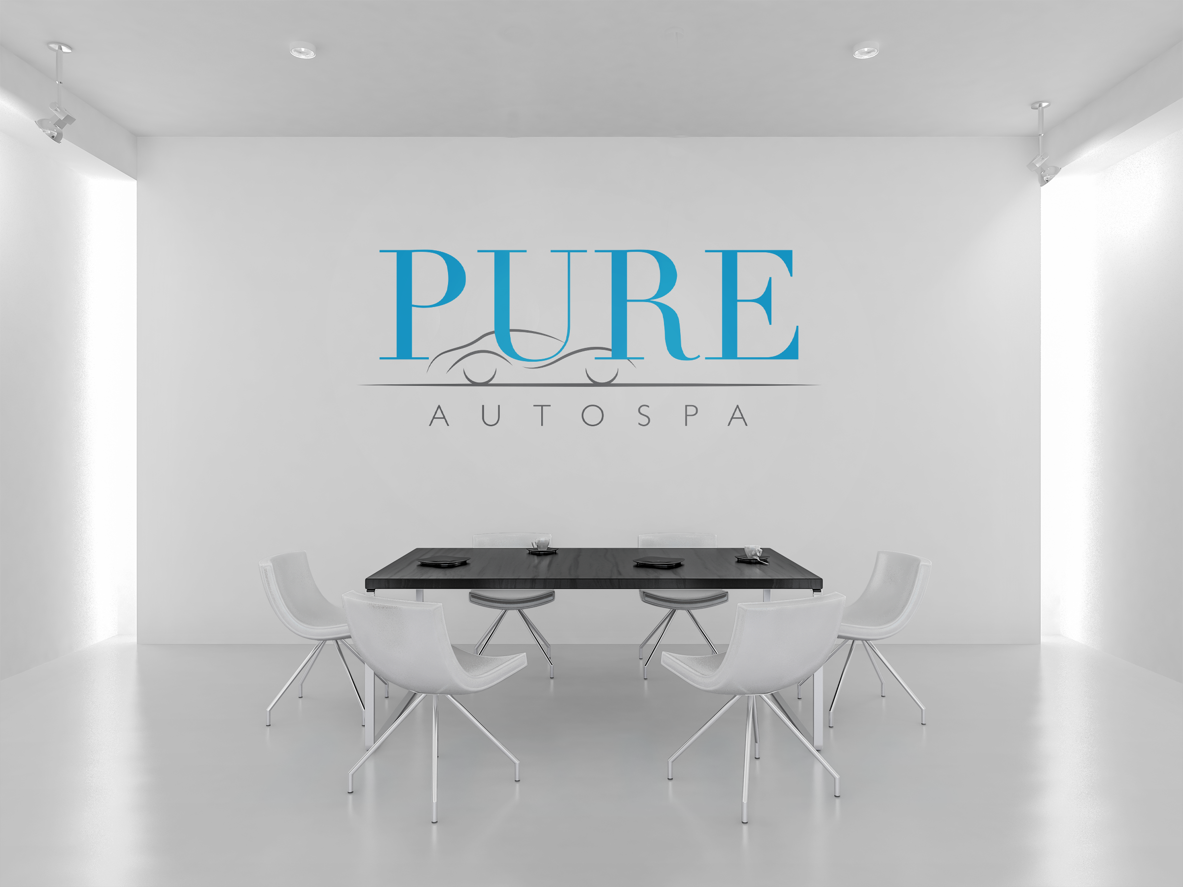
PURE
Pure auto spa is a luxury, top of the line car wash based in Atlanta. My intention was to represent the high quality service, facilities, and to communicate to the public the quality of Pure.
LOGOTYPE
The company logo was created using Didot and Gill Sans, which are both elegant typefaces that show luxury and class. The new combination resulted in a mark that is simple, modern, fresh and effective.
COLOR
This particular concept focused on water and luxury, so blue and grey where an obvious color choice, however, multiple shades and tints of these two colors were explored to find the right hue that captured the essence of the identity.